UI Improvement Idea for Panel Tabs

Hier diskutieren die Betatester von PhotoLine untereinander und mit den Entwicklern
Benutzeravatar
shijan
Mitglied
Beiträge: 1544
Registriert: Mo 23 Dez 2019 15:21
Wohnort: Ukraine

UI Improvement Idea for Panel Tabs

Beitrag von shijan »

I noticed that most modern image editing apps came to UI logic with tabs groups that don't have visible "Close" and "Collapse/Expand" buttons. "Close" and "Collapse/Expand" buttons where simply replaced by right-click menu items. As a result there are more free space for more tabs in row. In some apps "Close" button appears only in single ungrouped tab.
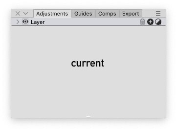
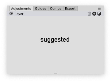
Currently in PhotoLine when tabs are grouped, "Close" button is not too useful because it closes all tabs in group. "Collapse/Expand" currently works very well with single click on tab title or empty space. So both buttons are rather not too important and only waste space and creates additional visual noise.
So what if remove those buttons from UI to save some space?

P.S. It is not something extra important, so no need to waste time if it is too complex task and if it will break many things after redesign.

BildBild

Also in WIndows this redesign will improve visual situation in upper right corner of the screen. (I personally noticed that few times i closed panel instead of window because by mistake pressed wrong X button there):
Bild
PhotoLine UI Icons Customization Project: https://www.pl32.com/forum3/viewtopic.php?f=3&t=6302
Benutzeravatar
Hoogo
Betatester
Beiträge: 4031
Registriert: So 03 Jul 2005 13:35
Wohnort: Mülheim/Ruhr

Re: UI Improvement Idea for Panel Tabs

Beitrag von Hoogo »

I like it.
My problem: I have 3 "X" in the upper right corner: Program, File, and Layer list. And quite often I close my list instead of the file.
----------------
Herr Doktor, ich bin mir ganz sicher, ich habe Atom! /Doctor, doctor, I'm sure, I've got atoms!